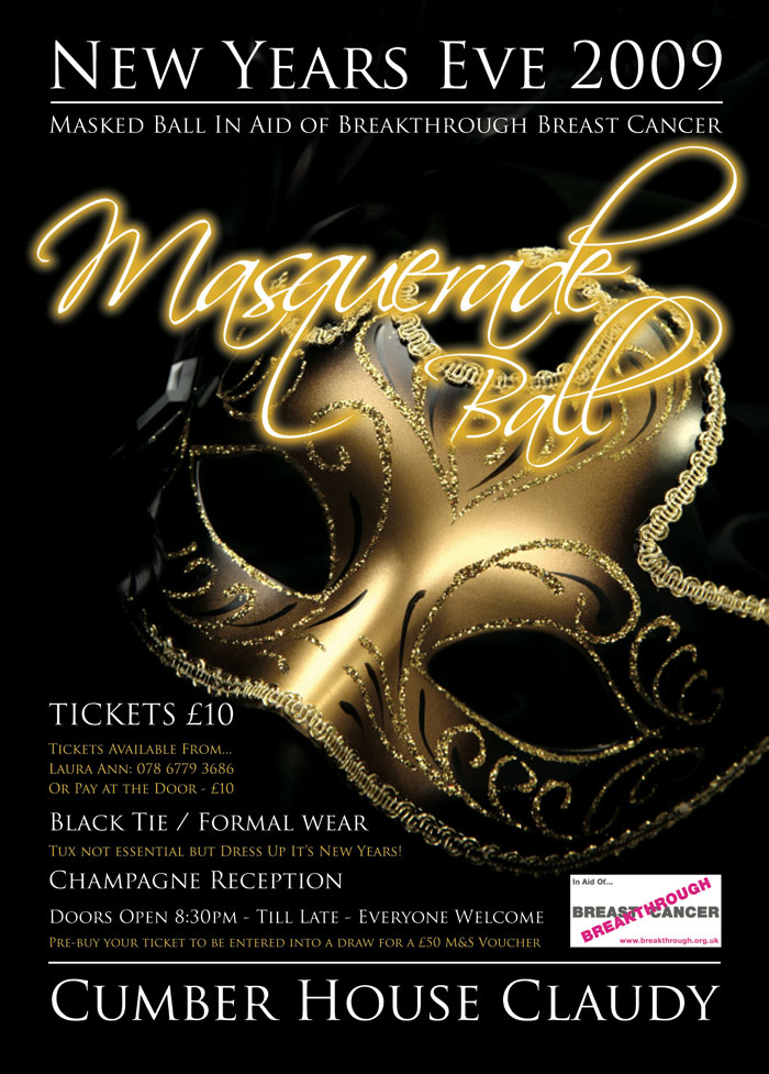
Duel After a Masquerade Ball
The Duel After a Masquerade Ball was painted by Jean-Léon Gérôme in 1857. He produced this
painting in a style known as Academicism
and worked in oil on canvas. The
painting depicts a duel after a costume ball in Bois de Boulogne, Paris.
The literal objects in the painting are mainly the men in their costumes and
their weapons. However the wilderness,
trees and snow surrounding them are also a big part of the painting as it sets
the scene. It is dawn on a wintry day in
the Bois de Boulogne
Wintry day which gives a sense of a bitter atmosphere and could be pathetic
fallacy for the characters as it represents the patriot being cold and
lifeless.
The background of the scene is simple and faded bringing
the characters at the front into the main focus. Gérôme
also uses less texture as it gets further back which exaggerates the distance.
For example he uses lots of texture and detail in their costumes and simplifies
the detail around them. The characters are dressed up in a variety of costumes;
they have different colours and patterns. The effect of this is that it makes
the painting stand out and more exciting to look at as they are all individual.
Their costumes mean they all represent something different and I believe that
the white represents innocence, the red danger and the black symbolizes death.
The Pierrot is in white and has blood stains on him which could magnify the
loss of innocence as he has witnessed this dual and the end of his life. Gérôme has also placed the white next to
black which is a contrast and makes the Pierrot stand out. The people in
the background are in shades of dull murky brown and fade into the background.
They are part of the painting but don’t detract attention from the main
characters. The colours graduate into duller colours as it gets further back to
look further away and flow together.
At first glance I feel the painting
is open for a lot of interpretation seeing as the people surrounding him could
be protecting him from something which has already hurt him or they could be
the attackers. I feel that they are helping him from the way they are holding
him up while he is vulnerable and weak slanting to the ground. In closer
inspection the Pierrot succumbs in the arms of the Duc de Guise. A Venetian doge
examines Pierrot's wound while Domino clasps his head in despair. To the right,
the victorious American Indian departs, accompanied by Harlequin.
There is lots of space in the landscape image as
everything figure is spread out. This makes the characters seem isolated and
the main attention is on the front characters.
Yet there is a sword at the very front of the painting highlighting the
theme of death. In each part of the painting there is something going on, which
makes it a very interesting piece to look at. There is the unity of the sword
and clothing while everything else is in pairs this could represent a lost life
with their valuables missing.
The range
of Jean-Léon Gérôme oeuvre included historical painting, Greek mythology,
Orientalism, portraits and other subjects, bringing the Academic painting
tradition to an artistic climax. I feel there are many interpretations you can
get from his painting and maybe this is purposely meant by him as he wants an
intrigued curious response from the audience. I believe that the artist
portrayed these individuals in costume so it
is a mystery
as to who they are and why they are in rivalry against one another. It makes it
more interesting when they are in masquerade as it seems almost fictional and
is a story within a story. When I look at the image I am intrigued as I want to
know what made this duel happen in the first place as the painting focuses on
the finished dual rather than the start. In the painting Gérôme replicates, with slight
variations, a composition he had executed for the Duc d'Aumale in 1857. It
suggests that he has strong feelings towards this event and is trying to get
his message across that the event shouldn’t have happened.
I really like this artwork because it has significant
meaning and it is based on history and focusing on life and death. I feel it is a brilliant piece of artwork
seeing as it is painted by French painter who is considered one of the most
important painters from this academic period and this adds artistic value to
the work. The painting requires a high level of skill to produce such a
detailed piece of work with so much meaning and history involved and I can see
this piece being displayed in a Museum. This is not a painting I find pleasing
to look at as it is quite depressing and very traditional where I prefer more
modern works of art but I admire it and appreciate how well thought out and painted
it is.


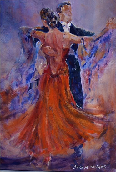
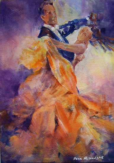
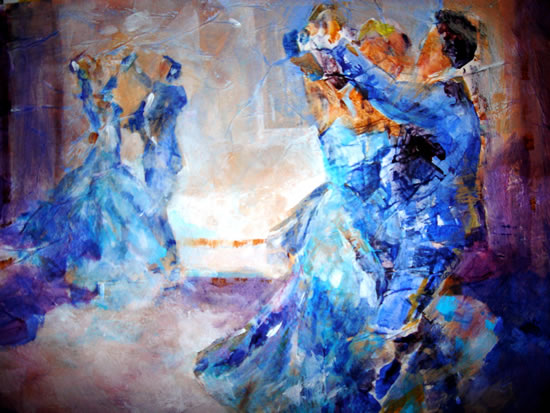 She uses block colour in different shapes, then smudges and blends in colour on the outlines of the figures clothing to give the painting movement. I am really inspired by Sera Knight’s work because I feel it represents the liveliness of ballroom dancing well and each painting gives off a different atmosphere through the use of colour. For example calm shades of blues with bursts of sharp royal blues creating a relaxed mood with intrigue, in contrast to orange and yellows giving a joyful mood. Her work is very original and isn't a direct copy of a scene, it is her own interpretation.